My January Journal Page

januaryjournalpage.jpg

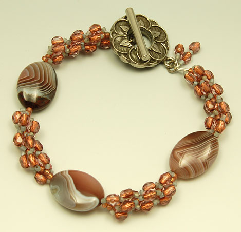
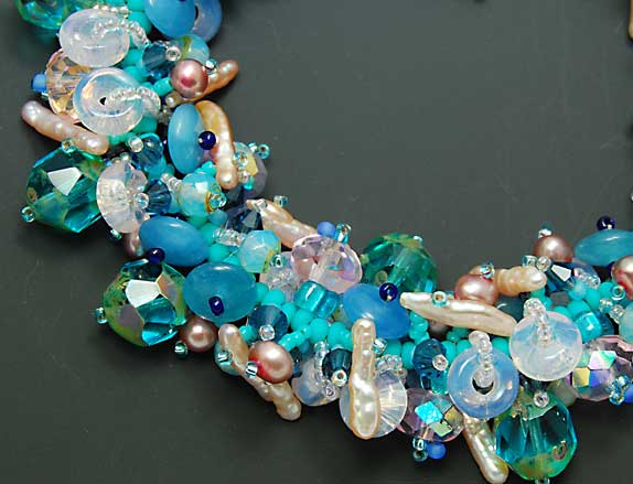
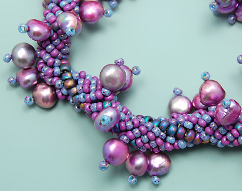
I just finished my January journal page today. I filled in my “path” with mauve colored pearls, representing the “pearls of wisdom” I’ve learned along the way. The photo doesn’t show it very clearly but the path has led me to a cache of beautiful multi-colored jewels. This symbolizes the treasure that lies inside each one of us.

My idea for my February page is of 2 hearts side by side, nourishing each other with a silver river that flows in a circle from one heart to the other and back again. Time to get my fabric prepared!

Saturday Morning Tea

tianmuqingdingdryleaf.jpg

On this bright, cold late winter morning, I am slowly savoring a cup of Chinese green tea, Tian Mu Qing Ding, and daydreaming about a hauntingly beautiful, misty mountain far far away.

This tea is named after the mountain upon which it was grown and harvested, Mt. Tian Mu. Its tightly rolled leaf opens up and reveals a fresh spring green color after steeping. Tian Mu is also the name of the Chinese Goddess of Lightning. I wonder if the mountain was named after her because it was believed to be her home. I couldn’t find any more information on her aside from a couple of sentences and a print.

tianmuqingdingwetleaf.jpgtianmuqingdingliquor.jpg

The liquor is a very pale straw color with a light, fresh vegetal aroma and taste. The vegetal quality of this tea is so mild that it would be another great choice for those trying green tea for the first time.

Bracelets on a light background

agatecrystalbracelet.jpg

I’ve moved onto the light part of the gradient background and think the bracelets stand out much better than on the darker part. I’m also having fun with experimenting on how close I can get before my camera can’t focus anymore. Pretty close. I love looking at things up close. It really pulls you into the moment and makes you hyper aware of a very small piece of space. Hello little world.

agatecrystalbraceletxx.jpg

I love the banding on these oval agate beads and the rosy copper crystal beads seem to glow from within.

What do you think of the lighter background?

Back to my Photos

fringyseabracelet.jpg

While the rain cascaded in buckets outside, I spent most of the day in my studio taking photographs of my jewelry. One of my goals is to update my website with new jewelry so the photos need to be taken first. I have experimented with various props in the past but this time I decided to just take the photographs on a simple gradient background with no props. I concentrated on the bracelet category and took one full shot and one or two closeups of each bracelet.

fringyseabraceletx.jpgpurplepearlspiralbracelet.jpgpurplepearlspiralbraceletx.jpg

Since the bracelets are smaller than a necklace, the photo doesn’t have the full gradient effect for the background. I think it works though. The background is so simple that you just focus on the bracelet. I like to have closeups so you can almost feel the texture and can see the beadwork up close.

Would it help to also see a photo of the bracelet on a person or a hand display?