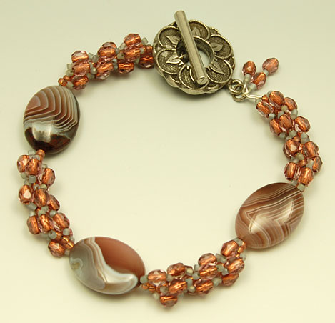
I’ve moved onto the light part of the gradient background and think the bracelets stand out much better than on the darker part. I’m also having fun with experimenting on how close I can get before my camera can’t focus anymore. Pretty close. I love looking at things up close. It really pulls you into the moment and makes you hyper aware of a very small piece of space. Hello little world.
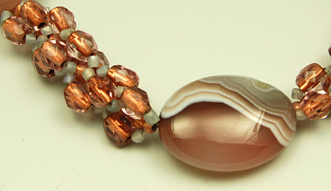
I love the banding on these oval agate beads and the rosy copper crystal beads seem to glow from within.
What do you think of the lighter background?

Oh yes – there is much more depth with the lighter background. The piece seems like it is floating. All the little dark details stand out and seem more visible.
You are going through the tried and true method of trail and error to find out what works best for photographing your jewelry!
It’s interesting how I have tried various backgrounds and settings – patterned paper, gradient paper, using props, natural light, fluorescent light in the light tent – and have settled on a simple light colored background. You’re absolutely right. It’s all about experimenting to see what works best!
oh, my goodness. Gorgeous! And I like this background, as well.
Thanks Steph!
I loooooooove that bracelet – it’s gorgeous. The colors go so well together. And I love the … clasp (or whatever the word for it is!) You are so talented.
Thanks Amanda!