With my photo experiments so far, I have used natural light and flourescent daylight bulbs, colored paper and a black velvet bust. The photos taken in the natural light of my window were too dark. The photos taken on the black velvet bust were too flat looking. The photos taken on the colored paper looked too busy to me. The jewelry was getting lost in the color of the paper. Some props I used competed with the jewelry. Then I borrowed some gradient paper and did some experimenting. It is the best so far, I think. Clean and professional looking, it does not compete with the jewelry at all. In fact, it seems to make the colors of the jewelry stand out so it enhances the piece.
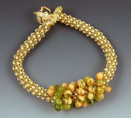
My “Woodland Fairy” bracelet was inspired by a stitch technique in the marvelous book, “Mastering Beadwork” by Carol Huber Cypher. Carol calls the technique “peyote-carry-one” and it is similar to a Dutch spiral in that you add an extra bead which is then not woven into on the next round. It gives more fluidity and drape than regular tubular peyote which can be pretty stiff. It also enables you to add a bead with small holes since you don’t stitch into it on the next round. I decided to use the drop beads I used in my “Woodland Fairy” necklace but I didn’t want to carry them through the whole bracelet. I think it gives the look of a textured bead in front.
What do you think?
