A brand new knitting project. I love to pick out my yarns.
With the Jane Thornley free-form “Come Spring” vest pattern in hand, I’ve chosen a similar color palette as the pattern photo because I love the vibrant greens and browns of this lovely season. One of my art friends directed me to a great website for purchasing good quality yarn at affordable prices. I purchased all of my yarn (pictured above) from them except for a ribbon yarn, called “Copper Penny”, I discovered while browsing at Joann Fabric’s one day for art supplies.
So far, I’m liking the contrast between the stripes of rich color.

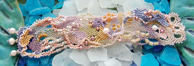
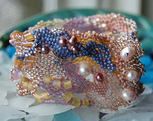
Last week I picked up a beading book at the library. As I have been getting into a more personally expressive and organic, free-form flow with my beadwork, I have lost interest in books and magazines devoted to beadwork patterns and other artists’ designs. However, the title of this book, “Shaped Beadwork: Dimensional Jewelry with Peyote Stitch”, caught my eye and my interest.

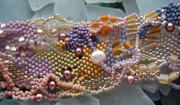
In the book, Diane teaches how to make geometrical shapes in peyote stitch, starting with flat one-dimensional shapes and then building upon those to create 2 and 3-dimensional sculptural shapes. So, I started at the beginning of the book and made a triangle. Geez, that was fun. How about if I make another one? Cool! Then I sewed them together and created a little triangular pillow. This little shape is fascinating me. I find myself picking it up and turning it over gently in my hand every time I walk by my beading tray.
Now, what shall I do with this little shape? Make another pillow for a pair of earrings? Use it as a focal shape and free-form around it? Use it as a component in a mixed media necklace? The infinite possibilities bloom in my imagination with wild abandon like the riot of pink peonies in my garden. Hehe Interestingly, my thoughts also lead me back to memories of how much I enjoyed geometry class and its spatial language.
All this from a little triangle pouch.

The start of another journal page. I had vaguely remembered someone mentioning or reading somewhere that you could paint on used dryer sheets. This so appealed to the recycling devotee in me that I collected some sheets after a weekend of laundry chores. After dripping, brushing, and wetting paint across its surface, I let my sheet dry and then ripped a piece off to create a waterfall shape on my bright yellow page. I then glued some dried tulip petals at its base and drew some water swirls around the petals with a white gel pen.
This page is far from finished but it has a good start. As I glued and painted my “waterfall”, I thought of water and its symbolism to feelings. I thought of how my page could represent my getting in touch with feelings that are frightening to me and how I sometimes relegate those frightening feelings to a very deep place inside of myself. Can I ride my tumbling waterfall into the depths of myself and explore some of those feelings? I wrote:
I tumble down the waterfall inside of myself
to get in touch with my feelings.