Goals for the New Year

mauisunrise.jpg

I have been reading many blog posts lately about goals for the New Year. So, inspired by my online friends, I have set forth a few goals for myself for 2008.

-take a painting class/workshop to bring painting back into my life

-create a visual journal by sketching more

-recreate my website

-nurture my writing, including writing poetry

-plant a garden at my new home

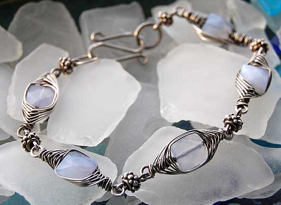
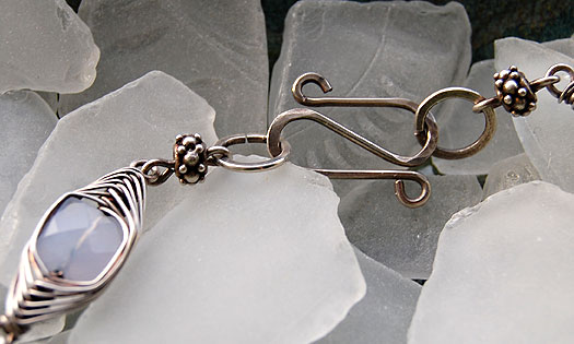
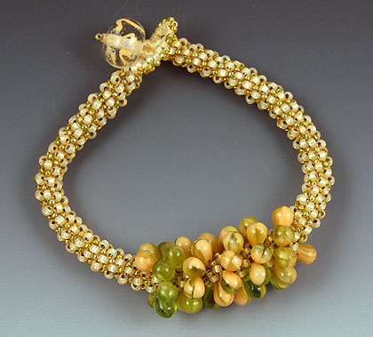
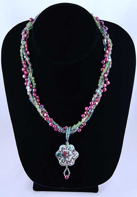
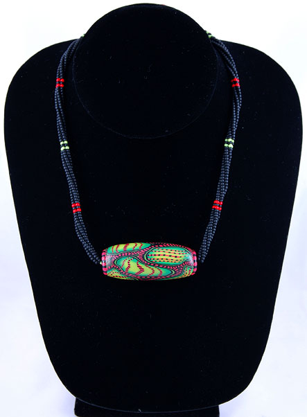
-open an Etsy account with updated photos of all of my jewelry

-learn transfer techniques so I may incorporate my photos into my art and my jewelry

-spend more time in nature

As I scan through my list, I see my resolution word, “Beauty”, already guiding me. In the last week, my meditations on my resolution word have led me from thinking about creating beautiful things to experiencing “beauty in the moment” and finally to finding the beauty in myself. As I approach my 50th birthday, I celebrate my blessings, my growth and, yes, my beauty.

Blue Chalcedony Bracelet

bluechalcedonybracelet.jpg

When I visited Michigan back in September, my SIL asked me to bring some beads along because she wanted me to create a bracelet for her. She was drawn to the idea of silver with either stone or crystal. After getting some ideas about what she likes, I created this bracelet for her as a gift. I wanted to experiment with a different technique in my wirework, one I hadn’t done before. So, in my internet research, I came across the work of Eni Oken. And, lo and behold, she offered some tutorials. Her work is exquisite and very inspirational. With the herringbone weave tutorial and some thin 26-gauge silver wire, I had a lot of fun learning and practicing. I chose these faceted blue chalcedony beads because I think they go very well with the wire. The color reminds me of shadows on snow drifts. Wire wrapping around their square shape was a little challenging at first but I soon got into a nice rhythm. After I created the individual wire wrapped links, I choose some small Bali silver beads to use for spacer links.

bluechalcedonybraceletclasp.jpg

I made a simple S-clasp from 18 gauge silver wire, hammering it slightly to give it some texture. Once the bracelet was constructed, it got a dunk in a liver of sulfur solution to give it a nice antique patina. I’m happy to say that she loved her gift, especially when she saw that it matched the sweater she was wearing perfectly! She’s on the right and my daughter is on the left.

aimeeandlisaxmas2007.jpg

Chalcedony is a form of silica and comes in many colors, the most common in the white to grayish blue to brown range. According to my book entitled Healing Crystals and Gemstones, it is named after the city of Chalcedon (Turkey) where it was first discovered. It was a popular carving stone in antiquity for motifs of gods and goddesses. According to its magical properties, it encourages calmness, purity and focus on what is essential.

An Autumn Bead Crochet Bracelet

autumnbeadcrochetbracelet.jpg

More bead crochet exploring. This time I used Perle Cotton 8 thread with size 6 glass beads. The black stripes on orange remind me of autumn and Halloween so I created a polymer clay pumpkin bead for the clasp.

So far, I like this thread the best in feel and ease of crocheting. The black color of the thread was a little tricky to find the stitch to go into but my hook slid into the stitch a lot easier than the C-lon cord. That was too stiff for my beginning skill level. This thread also gives a slinky supple feel to the finished bracelet which is a wonderful feeling on my wrist.

The loop for the clasp is a single crochet with the same thread. I then sewed terra cotta colored seed beads around the loop.

What I really loved in creating this bracelet is that it combined 3 techniques – polymer clay sculpture, bead weaving and bead crocheting.

I chose the blue graduated background because it reminds me of a clear autumn sky and it accentuates the orange beads. I love looking to nature for inspiration even in something simple like choosing a background for photography.

More photo experiments

woodlandfairybracelet.jpg

With my photo experiments so far, I have used natural light and flourescent daylight bulbs, colored paper and a black velvet bust. The photos taken in the natural light of my window were too dark. The photos taken on the black velvet bust were too flat looking. The photos taken on the colored paper looked too busy to me. The jewelry was getting lost in the color of the paper. Some props I used competed with the jewelry. Then I borrowed some gradient paper and did some experimenting. It is the best so far, I think. Clean and professional looking, it does not compete with the jewelry at all. In fact, it seems to make the colors of the jewelry stand out so it enhances the piece.

My “Woodland Fairy” bracelet was inspired by a stitch technique in the marvelous book, “Mastering Beadwork” by Carol Huber Cypher. Carol calls the technique “peyote-carry-one” and it is similar to a Dutch spiral in that you add an extra bead which is then not woven into on the next round. It gives more fluidity and drape than regular tubular peyote which can be pretty stiff. It also enables you to add a bead with small holes since you don’t stitch into it on the next round. I decided to use the drop beads I used in my “Woodland Fairy” necklace but I didn’t want to carry them through the whole bracelet. I think it gives the look of a textured bead in front.

What do you think?

White Balance

One of the disadvantages to having a camera with auto features is that you rely on the camera to just do all of the technical work for you. Point and shoot. Easy, right? Even auto focus which is a wonderful feature for my eyes pushing half a century old. Since I started using my Nikon D40 camera, I’ve been taking mainly outdoor shoots and indoor shots using the popup flash. Now that I am using my new light tent, I am taking photos with flourescent lighting. My first couple of shots (in my last post) came out so dark and flat looking even though I had my camera on a tripod and was able to slow down the shutter speed. I was getting quite frustrated and was beginning to doubt my new purchase. I always had better luck with natural lighting so why not just stick with that, I said to myself. Then my wonderful SO mentioned 2 little words that changed my focus (pun intended). White balance. White balance? Ooooohh, the camera has to be told that the lighting in the photos is from flourescent bulbs because, in essence, different kinds of lighting have an effect on the colors in your subject. Somehow I knew this but I never really thought about it in depth before. So, I pulled out the Nikon D40 bible that I had shoved in my camera bag, thinking I would never read all of that. I turned to the white balance section and sure enough, there is a setting for flourescent lighting. Now I was starting to feel pretty dumb about all of this. Those gremlin voices were screaming, “Geesh Karen, you’ve been taking photographs for how many years??” So, I let them have their say and just chalked it up to a learning experience. So, without further ado, here are my latest experiments.

secretgardennecklace2.jpgearlyspringnecklace2.jpgrainforestchoker2.jpg